Creating depth in flat illustration- Tricks used by children’s book illustrators
Flat illustrations look simple on the surface. That’s the whole point, right? Clean shapes, clear colors, nothing too heavy But when you really look at good children’s book illustration, you’ll notice something interesting — even the simplest scenes don’t feel flat at all.
They feel like you can step inside them.
That doesn’t happen by accident.
Over the years, working as a freelance children’s book illustrator, I’ve had many moments where a drawing looked “nice” but still felt… empty. No sense of space. No life. That’s when I started paying attention to what experienced children’s book illustrators actually do differently.
It’s not about adding more detail. In fact, it’s usually the opposite.
It Starts With Thinking in Layers
I didn’t always think this way. Earlier in my career, I used to draw everything almost on the same level. Trees, characters, background — all sitting together like cutouts.
Then one small change made a big difference: separating things into layers.
Not in a technical software sense, but visually.
Something in front. Something behind. Something even further back.
Even if everything stays flat in style, just letting a character overlap a brush, or a tree sit in front of a hill, suddenly creates space. You don’t need perspective grids or anything complicated. Just a bit of overlap can change the whole feeling of the page.
Size does a lot of the work
Children understand size instinctively. Bigger things feel closer. Smaller things feel far away.
So instead of forcing depth with shading or perspective, I often just adjust scale.
A large character in the foreground, smaller houses in the distance- that alone creates a sense of depth.
Many children’s book illustrators rely on this without even thinking about it too much.
It’s simple, but it works every time.
Color is quietly doing the heavy lifting
This is something I learned slowly.
At first, I used colors just to make things look nice. Bright here, soft there. But color can actually push things forward or pull them back.
Warm colors naturally come forward.
So if the background feels too strong, I just soften it a little. Not dull, just less dominant. And suddenly the main subject comes forward without forcing it.
In children’s book illustration, these small adjustments matter more than dramatic effects.
Overlapping Is Your Best Friend
If there’s one trick that almost every children’s book illustrator uses, it’s this.
Overlap.
When one shape slightly covers another, your brain instantly reads depth. No explanation needed.
A child standing in front of a tree. Clouds tucked behind a hill. Even something as small as grass overlapping a foot- it all adds up.
You don’t need to overthink it. Just avoid placing everything side by side like stickers.
Shadows…but don’t overdo them
Flat styles don’t really need heavy lighting. But completely ignoring shadows can make things float.
What I usually do is keep it very minimal. A soft shadow under the feet. Maybe a slightly darker tone on one side.
Nothing dramatic.
Too much shading can actually break the flat style and make it feel inconsistent. Many beginner freelance children’s book illustrators go too far here. I’ve done it myself.
Simple always wins.
Let the Composition Guide the Eye
Depth isn’t only about objects. It’s also about how the viewer moves through the scene.
A path that curves slightly. Trees getting smaller as they go back. Even the direction a character is looking can guide attention deeper into the page.
When I started focusing on this, my illustrations began to feel more like environments rather than just drawings.
That’s a big shift.
Texture — Just a Touch
Flat doesn’t have to mean lifeless.
Sometimes I add a bit of texture, just enough to break the smoothness. A slight grain, a soft brush effect — nothing too obvious.
Too much texture makes things messy. Too little can feel sterile.
It’s one of those things you learn by doing again and again.
Framing Changes Everything
This is a trick I use quite often now.
Instead of showing everything openly, I place something in the foreground — like a branch, a window edge, or a doorway.
It creates a feeling that you’re looking into a scene rather than just at it.
For storytelling, especially in children’s book illustration, this can make a big difference.
Keep the style consistent
One mistake I made early on was missing styles without realizing it.
Flat characters, but detailed backgrounds. Simple shapes, but heavy lighting in one corner.
It breaks the illusion.
Strong children’s book illustrators keep everything speaking the same visual language. Depth should feel natural, not forced.
A few words from my own Journey
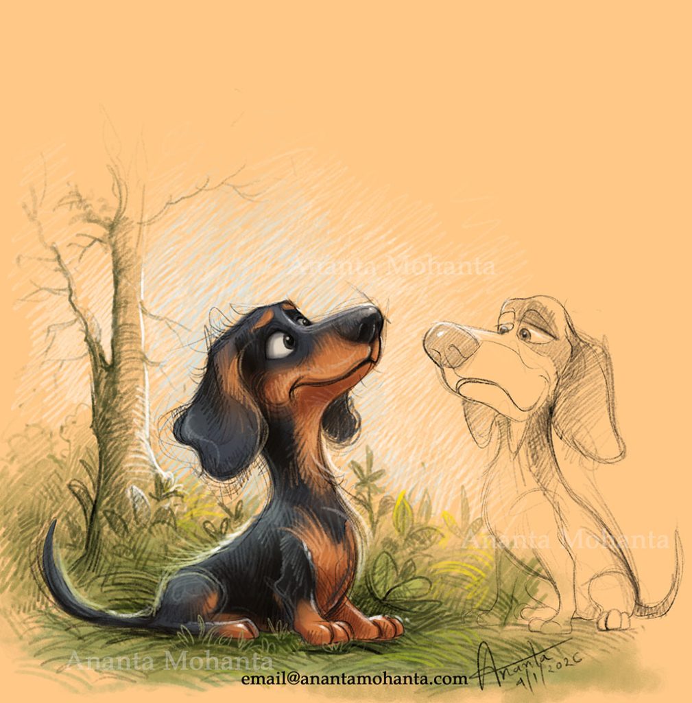
Ananta Mohanta is a freelance children’s book illustrator with over 15+ years of experience. He works with authors from around the world and is known for creating high-quality children’s book illustrations with a strong sense of storytelling, along with professionalism and reliability .
What I’ve learned over time is this — depth isn’t about making things complicated. It’s about making better choices.
Most of the time, when something feels off, it’s not because you need to add more. It’s because something needs to be adjusted, simplified, or repositioned.
Final Thought
Flat illustrations are powerful because they are easy to understand. That’s exactly why they work so well for children.
But “simple” doesn’t mean “flat” in feeling.
The best children’s book illustrators know how to create space without losing clarity. A bit of overlap, a shift in color, a smarter composition — these small things bring everything together.
And when it works, you don’t notice the technique.
You just feel like the illustration is alive.
To know more: www.anantamohanta.com
Pinterest: https://in.pinterest.com/illustratorananta/
X: https://x.com/AnantaMohanta6
Behance: https://www.behance.net/ananta-mohanta
Follow me on Instagram: www.instagram.com/ananta_mohanta_