How a quiet reading moment becomes a powerful children’s book illustration- Ananta Mohanta, children’s book illustrator
There is something deeply magical about a quiet moment in a children’s book. No action, no chaos. Just a character, a small space, and a feeling that gently settles into a reader’s heart. These are the scenes that children return to again and again- the ones that feel safe, warm, and real.
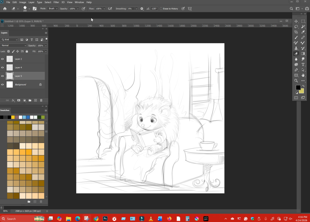
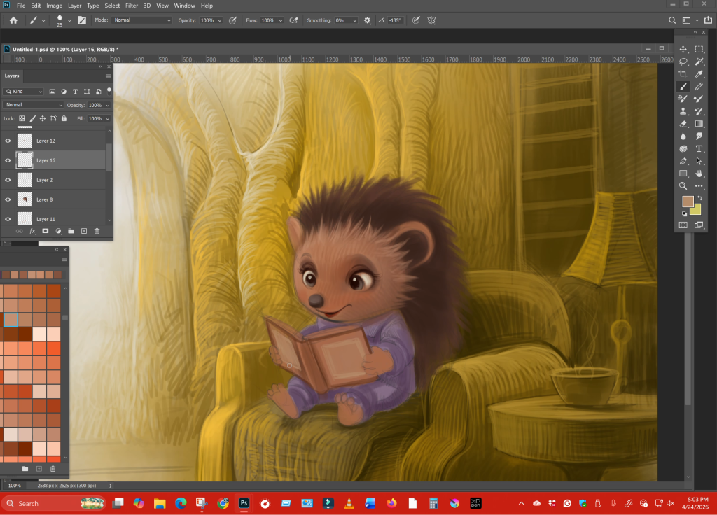
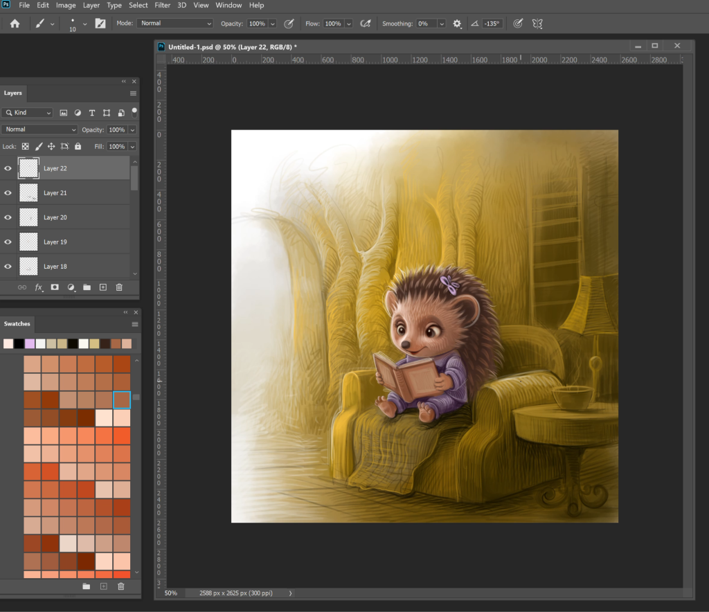
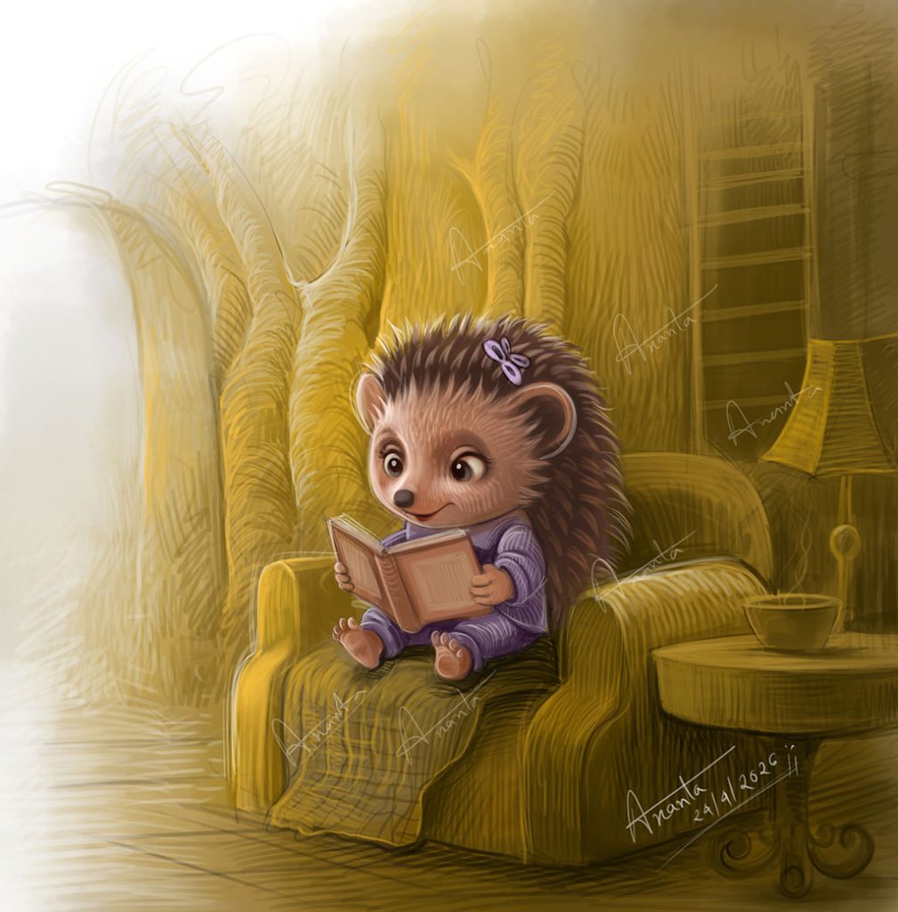
As a children’s book illustrator, I have found that these calm moments often carry more emotional weight than the busiest, most detailed spreads. A simple scene – like a little character sitting in a chair, reading a book- can speak louder than an entire page filled with movement. But creating that kind of emotional depth is not accidental. It is built carefully, layer by layer.
Why calm scenes work in children’s books
Children don’t just look at pictures- they live inside them. When a scene is calm, it gives them space to breathe, to imagine, and to connect. A quiet illustration slows the pace of the story. It invites the child to pause, observe, and feel.
In storytelling, contrast is powerful. If every page is loud and energetic, nothing stands out. But when a peaceful moment appears, it becomes a place of rest. It balances the narrative. It also mirrors real life—children understand the comfort of sitting quietly, holding a favorite book, feeling safe in a familiar space. For authors looking to hire a children’s book illustrator, this is something worth paying attention to. An illustrator’s ability to handle silence and stillness is just as important as their ability to draw action.
Building emotion without movement
One of the biggest challenges for any freelance children’s book illustrator is creating emotion in a scene where nothing is “happening.” There are no running characters, no dramatic gestures. Everything depends on subtle choices. Composition plays a key role. Where the character sits, how much space surrounds them, and how the environment wraps around them—all of this shapes the mood. A slightly curved chair, a soft background, or a gentle flow in the lines can make the entire scene feel more intimate.
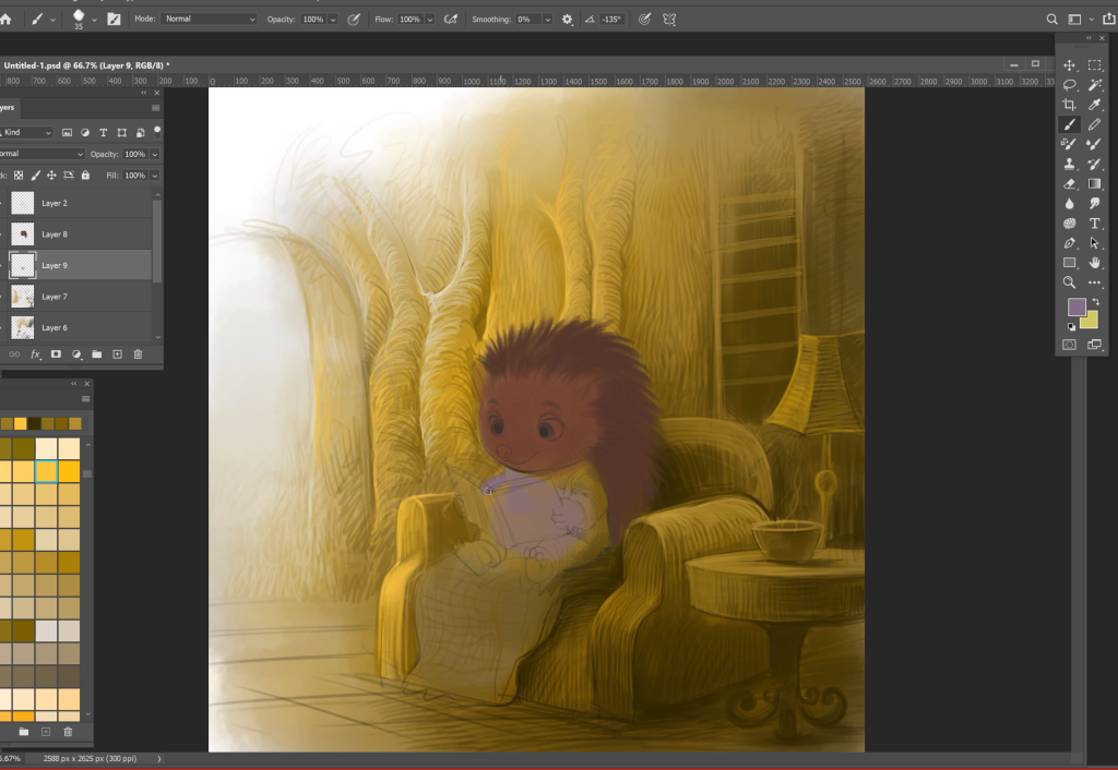
Then comes texture. Soft brush strokes, layered shading, and delicate transitions between light and shadow help remove any harshness. The goal is to make the image feel like a quiet whisper rather than a loud statement.
Even the smallest detail matters. The way the book is held. The tilt of the head. The placement of the feet. These are not random decisions—they are emotional cues.
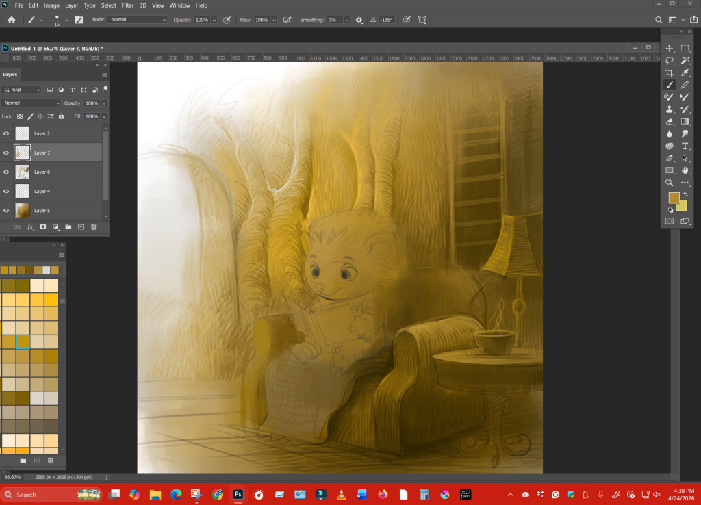
The power of warm yellow tones
Color is often the first thing a child feels before they even understand what they are looking at. In calm scenes, warm tones—especially yellows and soft golds—play a crucial role.
Yellow has a natural association with warmth, light, and safety. It reminds us of sunlight, of evening lamps, of cozy indoor spaces. When used carefully, it wraps the entire scene in comfort.
In this kind of illustration, the yellow is not flat. It shifts subtly lighter in some areas, deeper in others. This creates depth without breaking the mood’s softness. Shadows are not harsh; they blend gently into the surroundings. For a children’s book illustrator for hire, understanding color psychology is essential. Publishers often look for artists who can control mood through color, not just fill space with it.
Character expression: Small details, big impact
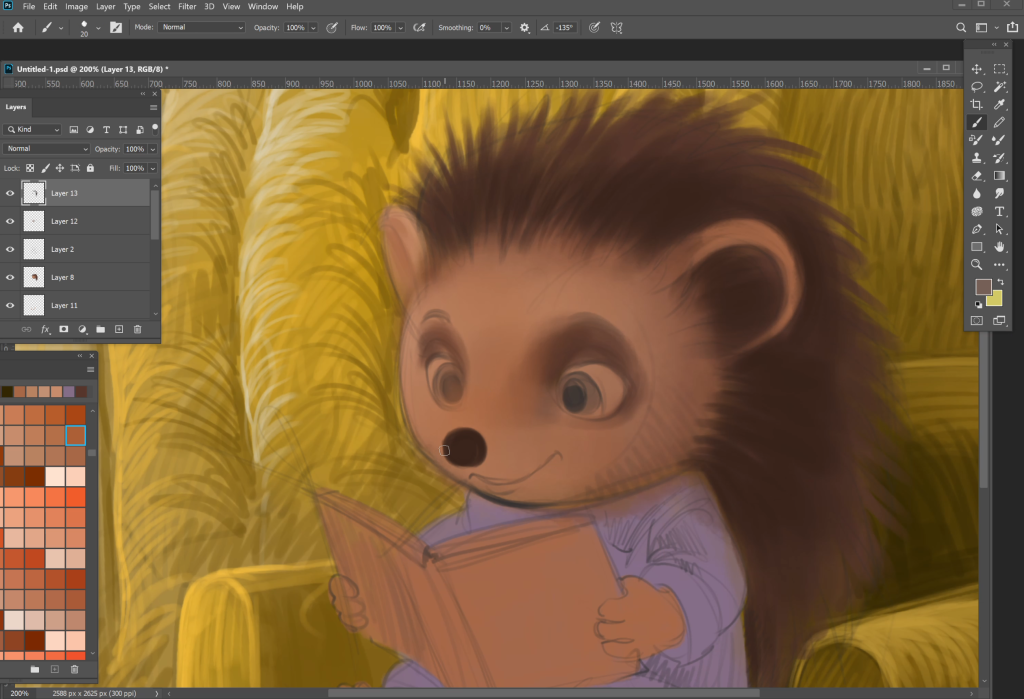
In a quiet scene, the character carries the entire emotional weight. There is no action to distract the viewer. Everything depends on expression.
The eyes are the most important element. Slightly winded eyes can show curiosity. A gentle downward gaze can show focus. When a character looks at a book with soft attention. The child reading the illustration begins to feel that same focus.
Then comes the smile- not a big, exaggerated one, but a small, natural curve. It suggests contentment rather than excitement. It tells the reader, “This is a peaceful moment”.
Posture adds another layer. A relaxed body. Slightly leaned forward. Creates a sense of comfort and engagement. Even the way the character’s feet rest can influence how grounded the scene feels.
These details may seem minor, but they are what separate a good illustration from a memorable one.
Why publishers look for feelings, not just skill
Today, there are many artists with strong technical skills. Clean lines, accurate anatomy, and polished rendering are no longer enough. What publishers truly look for is emotional storytelling.
They want a children’s book illustrator who can make a child feel something – even in the quietest scene. They want illustrations that stay with the reader long after the book is closed.
This is especially important for authors who want to hire a children’s book illustrator. The right illustrator doesn’t just draw your story- they deepen it. They bring out emotions that may not even be written in the text.
A calm reading scene might seem simple at first glance. But when done right, it becomes a powerful moment of connection between the child and the story.
Final thoughts
A quiet illustration is never truly “quiet.” It speaks softly, but it speaks deeply. It builds trust with the reader. It creates a safe space inside the book. As a freelance children’s book illustrator, I believe these moments are where the real magic happens—not in the noise, but in the stillness.
They remember how a page made them feel.
A warm chair.
A soft light.
A small character holding a book, completely lost in it.
That feeling stays.
And that’s what I try to create every time I sit down to illustrate—not just a scene, but a moment that feels real enough to pause on.
Because sometimes, the quietest pages speak the loudest.
To know more: www.anantamohanta.com
Pinterest: https://in.pinterest.com/illustratorananta/
X: https://x.com/AnantaMohanta6
Behance: https://www.behance.net/ananta-mohanta
Follow me on Instagram: www.instagram.com/ananta_mohanta_