When an author looks for a children’s book illustrator, the biggest mistake is judging only the final artwork. A polished image can be misleading. What truly matters is the process behind it. The images you see here are not random stages; they are a complete journey. Each step shows how a simple idea turns into a finished illustration with emotion, depth, and storytelling.
Let’s go through it one by one-
Rough Layout
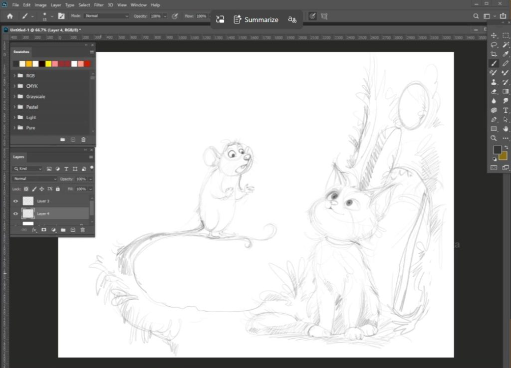
Where the Story Begins In your first sketch, everything begin with a rough layout.
The cat sits on the right side, the mouse on a curved branch to the left. The environment is only hinted at—just enough to understand the scene. The branch forms a natural circular flow, pulling the viewer’s eye from the mouse to the cat.
At this stage: No clean lines, no details, only storytelling decisions. You are solving questions like: Where should the characters sit? How do they interact? What space feels natural? This is where a professional illustrator thinks—not decorates.
Refined Sketch & Line Art
Structure Takes Shape In the next image, the drawing becomes more confident. The cat’s face is clearer, the mouse’s posture more expressive. You can already feel the relationship between them—curiosity from the cat, slight nervousness from the mouse.
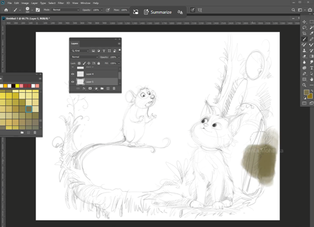
Important things happening here-
- Lines are still soft, not even clean.
- Expressions are defined.
- Anatomy is adjusted for appeal.
This stage proves something important-
If the drawing works in the line, it will work in color
Many inexperienced illustrators skip this strength and rely on effects later.
Environmental blocking- building the world
In the 3rd image, the color begins, but not everywhere.
You first focus on the background environment. Especially on the right side, just tree foliage appears.
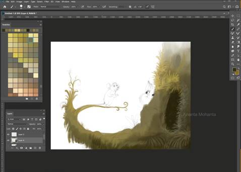
The mossy texture and warm, earthy tones begin to shape the mood.
Notice-
1. The background starts to develop before the characters.
2.The palate is controlled (deep greens, light greens, light yellow muted tones)
3. Light direction is introduced already.
This is not random coloring. It’s a planning atmosphere.
Character integration- Bringing focus to the scene
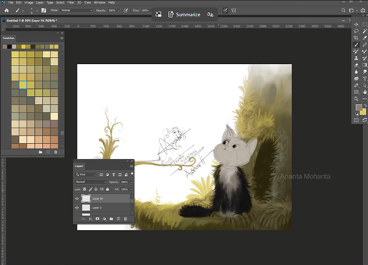
In the next stage, the cat is rendered while the mouse is still in sketch form.
This is where patience matters most-
Layer by layer.
One character is finished first to set the quality and lighting.
The rest follows the same standard.
The cat has now-
- Soft fur rendering
- Controlled highlight
- Warm and cool balance
- The background fades softly, keeping focus on the interaction
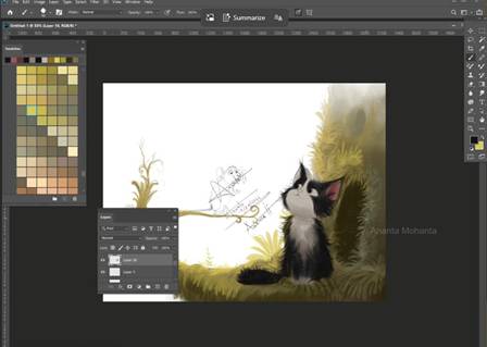
5.The mouse has gentle highlights that keep it visible.
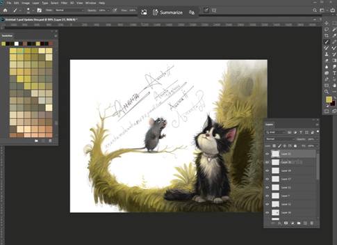
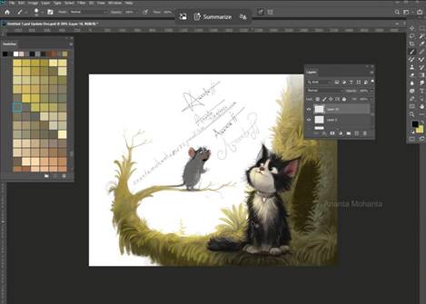
Final pass- everything comes together
In the last stage, I complete the mouse and refine the entire scene. The mouse is fully painted, the branch is detailed, and the environment wraps around the characters. The lighting is soft and consistent.
Now I focus on small things:
- how light touches the characters
- how much detail the background should have
- where to keep things soft
Nothing should distract from the interaction between the cat and the mouse.
Even the background is toned down slightly to keep focus on where it belongs.
What I am trying to show-
1. The cat’s fur is not flat black- it has depth and variation
2. The mouse remains noticeable, even though it is small
3. The background does not overpower the characters.
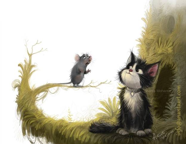
Character Design – Keeping It Simple (On Purpose)
The cat and mouse are not overdesigned.
That’s intentional.
The cat is soft, rounded, and almost fluffy enough to feel harmless and curious.
The mouse is small, slightly exaggerated, so the emotion reads clearly.
Children respond to clarity, not complexity.
Too many details actually work against the story.
Color Variation – Controlled, Not Overdone
Your palette stays consistent throughout:
- Earthy greens
- Warm yellow light
- Subtle contrast
Instead of using too many colors, you:
- Adjust tones within a range
- Use light to create focus
- Keep harmony across the scene
That’s what gives the illustration a calm, storybook feel.
What Authors Should Learn From This
If you are hiring a children’s book illustrator, this process is what you should look for.
Not just a final image—but:
- Clear step-by-step development
- Strong drawing and line art before coloring
- Thoughtful and unique composition
- Controlled color usage
- Consistency from start to finish
If an illustrator cannot show their process like this, it’s worth questioning how the work is actually created.
Final Thought
A real children’s book illustration is not made in one step.
It is built slowly:
- From rough ideas
- To structured drawing
- To carefully color
- To emotional storytelling
These images show that journey honestly.
And that honesty is exactly what authors should look for when trusting someone with their story.
Watch my full children’s book illustration or digital illustration video on my YouTube channel-
https://youtu.be/QEnPcfnGGQ4?si=N8SuNnPHthNJJkf7
To know more: www.anantamohanta.com
Pinterest: https://in.pinterest.com/illustratorananta/
X: https://x.com/AnantaMohanta6
Behance: https://www.behance.net/ananta-mohanta
Follow me on Instagram: www.instagram.com/ananta_mohanta_